I re-designed and standardized a background verification app with 65M+ users and 350+ large corporate clients.
The Problem with Background Verification
Many companies in India still rely on manual checks for employee verification that can take weeks, creating frustration for both businesses and employees. Existing verification tools have several issues like false positives, no consolidated reports, and hassle of managing multiple vendors. On top of that, the need to upload sensitive personal documents makes trust and data security absolutely critical.
Slow Process
Inaccuracy
Overly Complex
The Goal
1. Make background verification faster and easier for users. 2. Build trust through security and transparency. 3. Seamlessly integrate with partner businesses, with their background verification requirements and branding.
The Process
Getting Started:
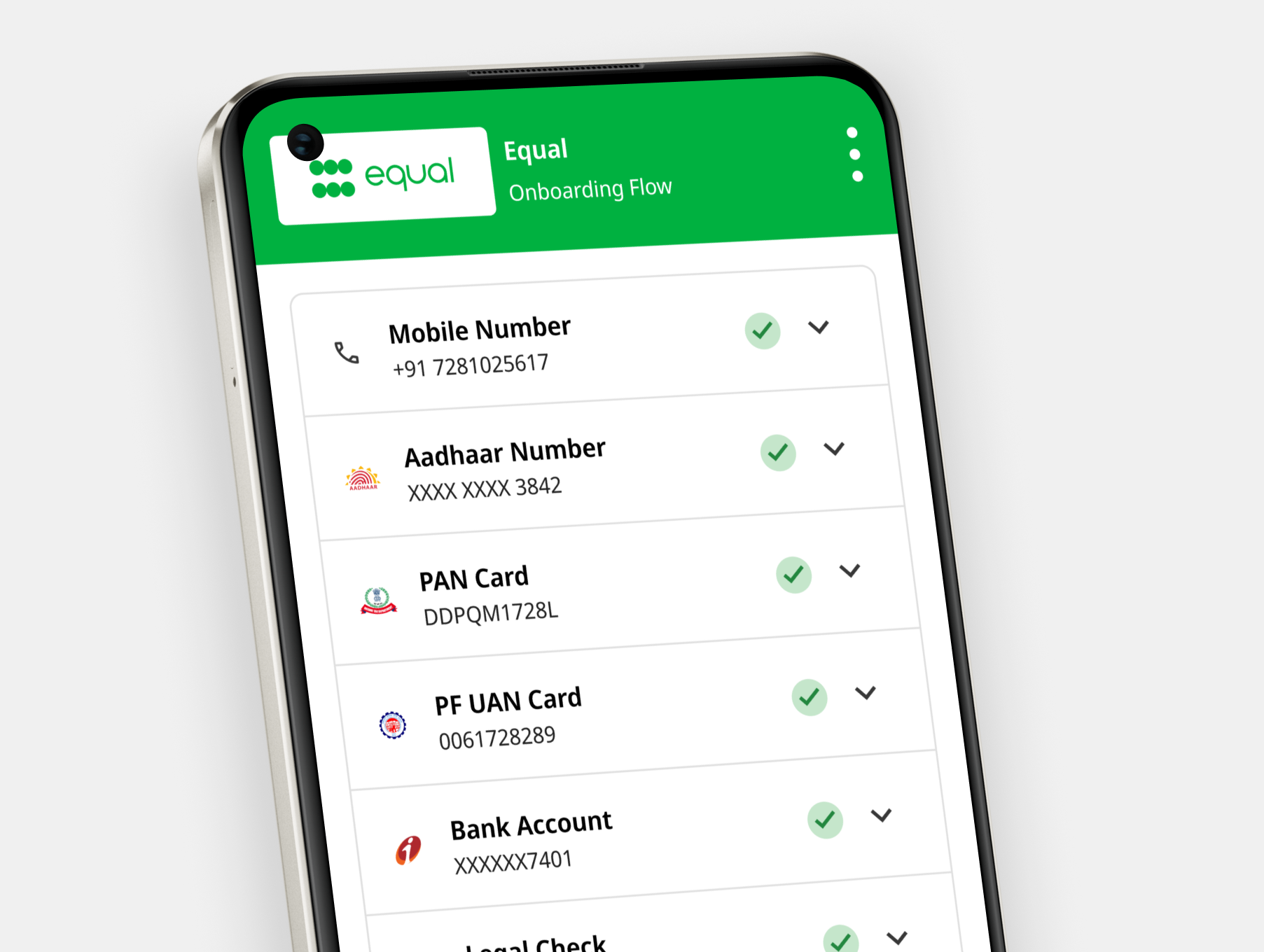
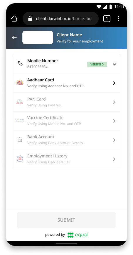
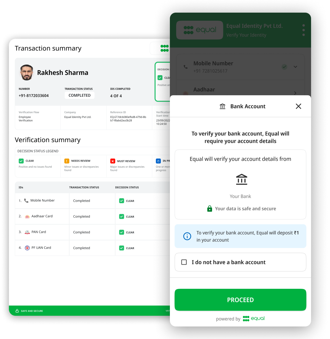
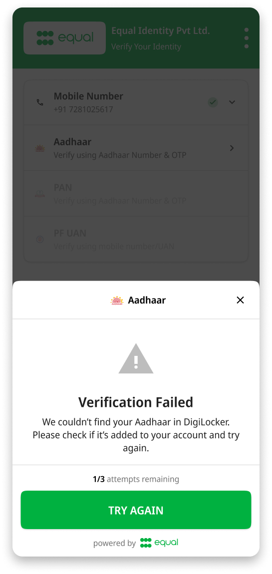
I joined the project in the middle of a complete re-design of our background verification (BGV) web app. My first task was to design new “keys” (individual checks that fetch background information through unique identifiers such as Bank Account or Employment History).
As I gained more context of the project, I realized many of design decisions looked odd at first, but were driven by user behavior. Most users were completely skipping screens without reading any information, just pressing the CTA as soon as they saw one available.
It was completely different than what we had expected from a young userbase with good technical literacy. This led to a re-design of the entire app, both visually and logically. I had to think holistically when it came to design changes during this process, considering how each decision affected consistency across product and tech teams, design systems, and the long term business goals.
Collaboration:
Throughout the project, I collaborated closely with system engineers and developers, aligning on how changes would propagate across the system. This experience taught me that strong communication, clear reasoning, and stakeholder buy-in were just as important as design craft.
I worked with the product team to ensure new features aligned with business needs and matched the designs we created on Figma. I also coordinated with the sales team to provide design support for client pitches.
Execution:
Once familiar with the system, I created new keys efficiently by referencing approved patterns and components.
While maintaining consistency between our design systems, new design improvements/changes, and the development team, I then created BGV flows for large clients as per their custom requirements. I also designed consolidated reports for them to verify all information of a candidate in a single place.
Edge Cases and Futureproofing:
Every government document or ID type brought unique edge cases. I collaborated with developers to capture existing ones while proactively designing for potential future scenarios, so we would be prepared ahead of time.
Attention to detail was critical. Whether it was ensuring accessibility and contrast across text-heavy screens, balancing visual hierarchy in forms and text heavy screens, or making sure micro-decisions (like green checkmarks clashing with our green brand) didn’t disrupt usability or branding.
The Outcome
The re-design resulted in a smoother, consistent BGV flow that met both user and merchant need better, with data to support it. It also supported sales efforts, and proved to be an overall better digital experience.
97%
Highest Success Rate in India
593k
New Quarterly ID Checks
Reflections
Since this was a B2B product, I had to learn how to ensure a good user experience while making sure the product aligned with the business needs and specific requirements.
While I had some familiarity with design systems, I didn't have a lot of experience in it when I joined the project. Working on it was out of my comfort zone but helped me expand my skill set.
Direct collaboration with so many product and development teams was a great learning experience. Disagreements brought opportunities to improve